
If you’re wondering why your mobile app or store traffic isn’t turning into sales, the answer often isn’t your marketing — it’s your mobile user experience (UX).
Research shows that over 85% of consumers say they’re less likely to return after a poor mobile experience, and 53% of users abandon a site if it takes longer than 3 seconds to load.
But UX mistakes aren’t always obvious. Sometimes, they’re small design or usability issues that quietly drain your conversion rate day after day.
For growing brands and eCommerce stores, fixing these subtle UX gaps can instantly lift conversion rates by 20–200%.
In this guide, we’ll cover the 8 most common mobile UX mistakes that quietly kill sales — and what you can do to fix them using modern UX best practices and lessons learned from real ShopApper clients.
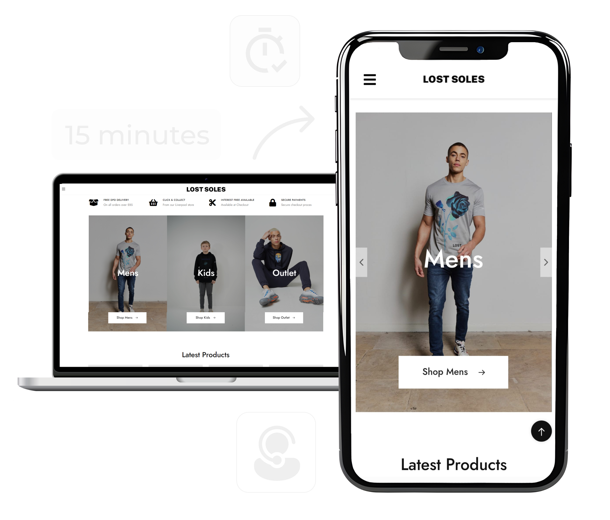
One of the biggest mobile UX mistakes is assuming that your website design can simply “fit” inside a phone screen.
Mobile is a different world.
Users expect thumb-friendly navigation, faster loading times, and minimal friction.
❌ What Goes Wrong
Tiny buttons or links that users can’t tap easily.
Pop-ups that block key content.
Pages that take forever to scroll through.
Navigation menus that feel like a maze.
When your mobile app or site feels like a squeezed-down version of your desktop design, users don’t stick around.
✅ What to Do Instead
Follow mobile-first design principles:
Use larger, well-spaced buttons (44px minimum height).
Keep navigation clear and limited to 4–5 primary options.
Prioritize your call-to-action buttons at the bottom (closer to thumbs).
Compress images and use adaptive loading for speed.
💡 Example:
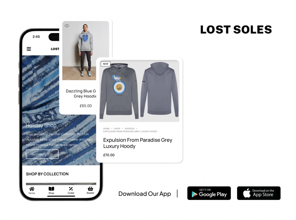
Lost Soles, a UK fashion brand, improved their UX by switching from a complex web layout to a clean, app-first structure using ShopApper. After launch, their mobile conversions grew by 300%, with fewer drop-offs on checkout screens.
You’d be surprised how many potential customers give up seconds before buying.
According to Baymard Institute, the average cart abandonment rate is 70.2%, and UX friction is a major cause.
❌ What Goes Wrong
Long checkout forms that ask for too much information.
Unclear “Continue” vs. “Place Order” buttons.
No guest checkout option.
Redirects between mobile browser and app store.
Every extra step is a chance to lose a customer.
✅ What to Do Instead
Apply mobile app UX best practices for checkout:
Autofill address and payment fields using saved data.
Enable Apple Pay and Google Pay for one-tap checkout.
Use progress indicators (“Step 2 of 3”) to show users where they are.
Keep error messages clear and friendly.
💡 Example:
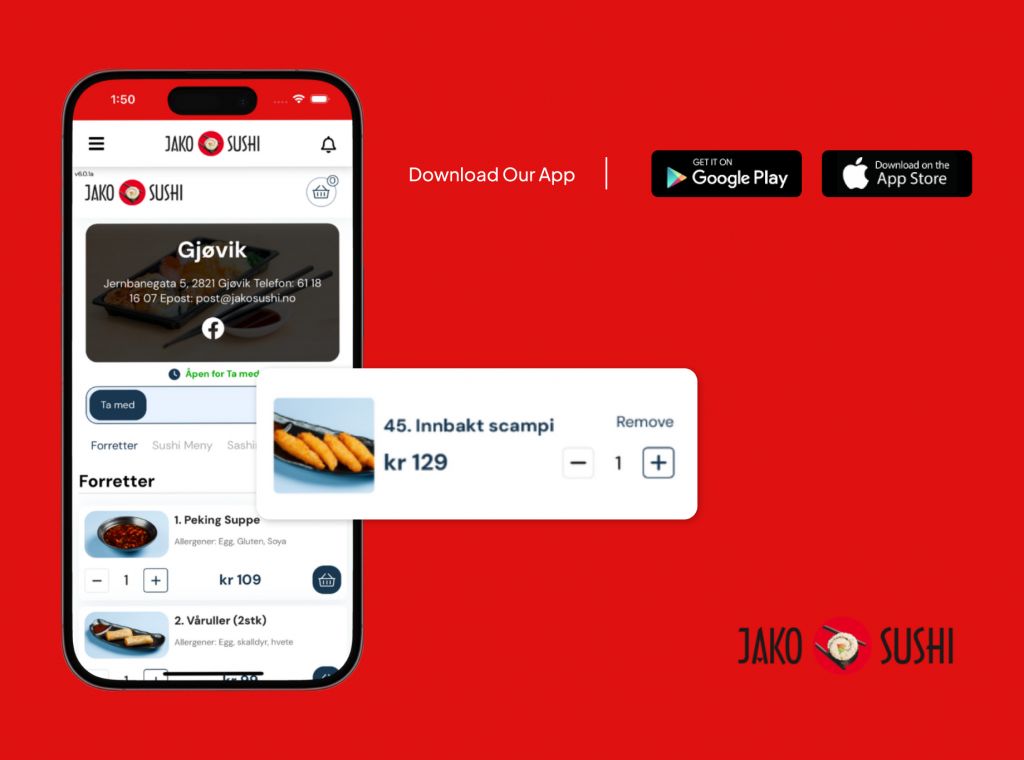
Jako Sushi, one of our clients, simplified its checkout process by integrating one-tap payments and clear progress bars through their app. Within months, app orders made up 32% of all sales, generating a 1220% ROI compared to web-only operations.
Speed is UX.
If your app takes too long to load, users bounce — period.
Google reports that a 1-second delay in load time can reduce conversions by 7%.
❌ What Goes Wrong
Unoptimized images or scripts.
Overloaded animations.
Too much visual clutter competing for attention.
A cluttered design overwhelms the user and creates mental friction, especially on smaller screens.
✅ What to Do Instead
Follow mobile eCommerce UX best practices:
Use lightweight visuals and lazy loading.
Eliminate unnecessary widgets and sliders.
Focus each screen on one clear action — no more than one CTA per page.
Preload data in the background to make transitions feel instant.
💡 Example:
When 4 Aces Competitions converted their site to an app with ShopApper, they reduced average load time by 58% and saved 2–3 hours daily in manual sync tasks. The app’s streamlined UX led to 27% of monthly orders now coming through mobile.
What works on desktop doesn’t always translate on mobile.
Your users don’t “click” — they swipe, tap, and scroll with one hand.
❌ What Goes Wrong
Menus or filters hidden behind tiny icons.
CTAs placed at the top, out of thumb reach.
No clear way to return to the home or cart page.
Poor navigation silently kills conversion rates because users can’t find what they want fast enough.
✅ What to Do Instead
Adopt bottom navigation bars and thumb zones:
Place key actions (Home, Cart, Account, Search) at the bottom for one-hand access.
Use sticky bars for Add to Cart or Checkout buttons.
Highlight active states clearly to avoid confusion.
📈 UX Stat: 76% of mobile users say ease of navigation is the most important factor in a mobile experience (Google, 2025).
At ShopApper, we design store apps using data-driven thumb zones — ensuring the navigation layout aligns with how users naturally hold their phones.
Your mobile app can have beautiful design and still fail — if users don’t know where to look first.
Visual hierarchy is about guiding the user’s attention through spacing, typography, and color contrast.
Without it, your app becomes a guessing game.
❌ What Goes Wrong
Too many competing colors and fonts.
Small product photos or cluttered galleries.
CTA buttons that blend into the background.
✅ What to Do Instead
Use bold, contrasting colors for key CTAs.
Make product images at least 70% of the screen width.
Use consistent typography across all screens.
Keep text minimal — scannable headlines convert best on mobile.
💡 Example:
Curved Angels, a fashion boutique running on WooCommerce, saw a 46% improvement in “add-to-cart” actions after ShopApper redesigned their product layout using larger visuals and simplified hierarchy.
Tiny animations and feedback elements can make a massive difference.
These micro-interactions — like a cart icon bouncing or a button confirming “Added!” — reinforce the feeling of responsiveness and delight.
❌ What Goes Wrong
Static buttons with no feedback.
Loading screens that feel endless.
Missing confirmation cues after actions.
✅ What to Do Instead
Use micro-interactions to:
Confirm user actions instantly.
Add personality and brand flair.
Reduce anxiety during loading or submission.
📊 Stat: Users are 47% more likely to trust apps that give instant feedback after an action (UXCam, 2025).
Even subtle micro-animations can increase the mobile app conversion rate by keeping users emotionally engaged throughout the journey.
Answer a few quick questions and get a custom report on your app potential, missed opportunities, and where to level up.
The first 30 seconds after someone downloads your app are everything.
If users feel lost or overwhelmed, they won’t come back — and uninstall rates will skyrocket.
❌ What Goes Wrong
Overly long tutorials.
Lack of guidance for first-time users.
Immediate registration requests without value shown.
✅ What to Do Instead
Follow mobile app UX best practices for onboarding:
Show benefits, not features — e.g., “Reorder in seconds” instead of “View your order history.”
Use progressive onboarding (teach as they explore).
Offer a guest mode to reduce friction.
Add a subtle welcome offer or reward for first purchase.
💡 Stat: Apps that use guided onboarding retain 50% more users after 3 months than those that don’t (AppFollow, 2025).
UX doesn’t end after checkout.
The post-purchase flow — confirmation, tracking, reorders — plays a huge role in customer retention and referrals.
❌ What Goes Wrong
No confirmation message or delivery updates.
Clunky account pages.
Users have to log in repeatedly to track orders.
✅ What to Do Instead
Include live order tracking and push notifications for updates.
Keep order summaries simple and visual.
Encourage app re-engagement with personalized recommendations.
💡 Example:
Jako Sushi’s app added a smart reorder button for previous meals — a simple tweak that increased repeat purchases by 18%.
This kind of micro UX improvement is often the difference between a one-time buyer and a loyal customer.
At ShopApper, we’ve seen firsthand how small UX improvements lead to big results.
That’s why every app we deliver — whether it’s converted from a WordPress site or built as a fully custom mobile store — is designed for conversion from day one.
Here’s how we do it differently:
Our app templates aren’t generic — they’re shaped by analyzing user behavior across hundreds of eCommerce apps.
The navigation, layout, and CTAs are built to increase mobile conversion rate and reduce abandonment.
Everything in your WooCommerce or WordPress store syncs live — products, orders, customers, and even coupons.
No separate management dashboard or double entry.
Built-in push notifications help recover abandoned carts, announce restocks, or launch app-exclusive offers — boosting conversions by up to 40%.
We help you monitor engagement, retention, and order value — with data that reveals what’s truly working.
Whether you just want to convert your website to app in minutes or launch a fully custom mobile storefront, ShopApper gives you both flexibility and support.
You get the simplicity of a no-code builder plus the craftsmanship of a development partner — without agency-level costs or delays.
💬 Our motto still applies: Grow Together.
Your app can have great products, fast hosting, and a beautiful brand — but if your mobile UX isn’t right, none of it matters.
A single friction point can silently eat away at your sales, customer loyalty, and reputation.
By avoiding the 8 mobile UX mistakes we covered today, you’ll not only increase your mobile app conversion rate — you’ll create experiences users enjoy coming back to.
If you’re ready to turn your WordPress or WooCommerce site into a high-performing mobile app that looks beautiful and sells effectively — ShopApper can help.
You can:
Convert your existing site to an app in minutes, or
Work with us to build a custom-designed, conversion-optimized mobile store.
Both paths lead to the same destination:
more sales, better retention, and a smoother customer journey.
🪄 Ready to See What a Sales-Optimized Mobile App Looks Like?
Book a real demo, not a presentation ⬇️
Take the first step toward an app for your online store. Schedule your free call and see how easy it is to get started with a full-service solution like ShopApper.
Features
Start By Industry

I’m Ece, your Account Manager. I’m eager to learn about your business and assist you in achieving your goals.
Please share some info about your business so I can be fully prepared to answer your queries. I’ll reply within 15-20 minutes. Thanks! ![]()